Refresh and revamp the brand and positioning for a worthy Australian charity to help raise awareness and funding for cancer research and personal wellbeing.

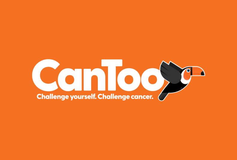

As an organisation, CanToo provide a range of services and programs geared at helping improve the fitness and well-being of thousands of Australians, which in turn facilitates raising valuable funds for important cancer research. However, the brand lacked consistency due to limited internal resources and a clear direction on how to position CanToo to a wider market.
Tonic was approached to help develop a clear and distinct brand and strategic plan to help better position CanToo and improve their online presence to increase registrations and much-needed donations.
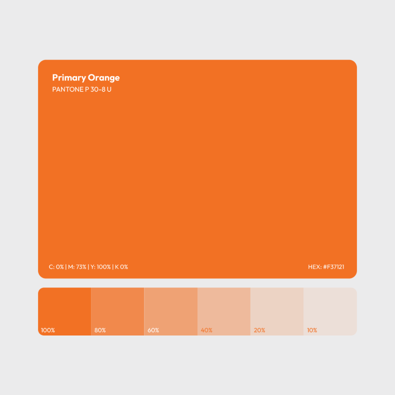
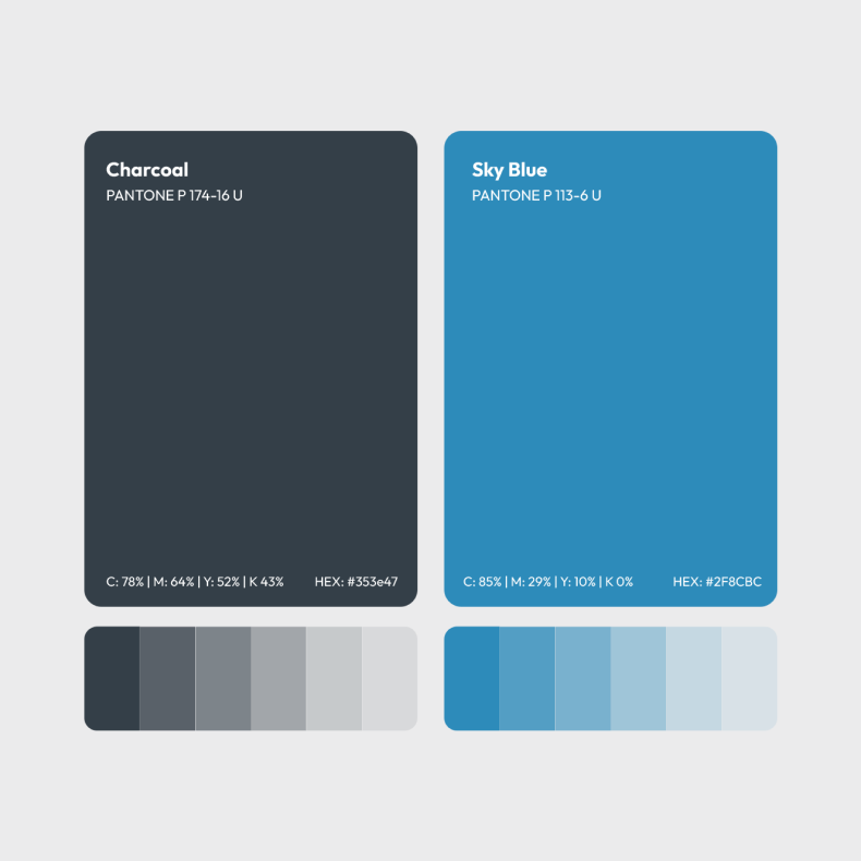
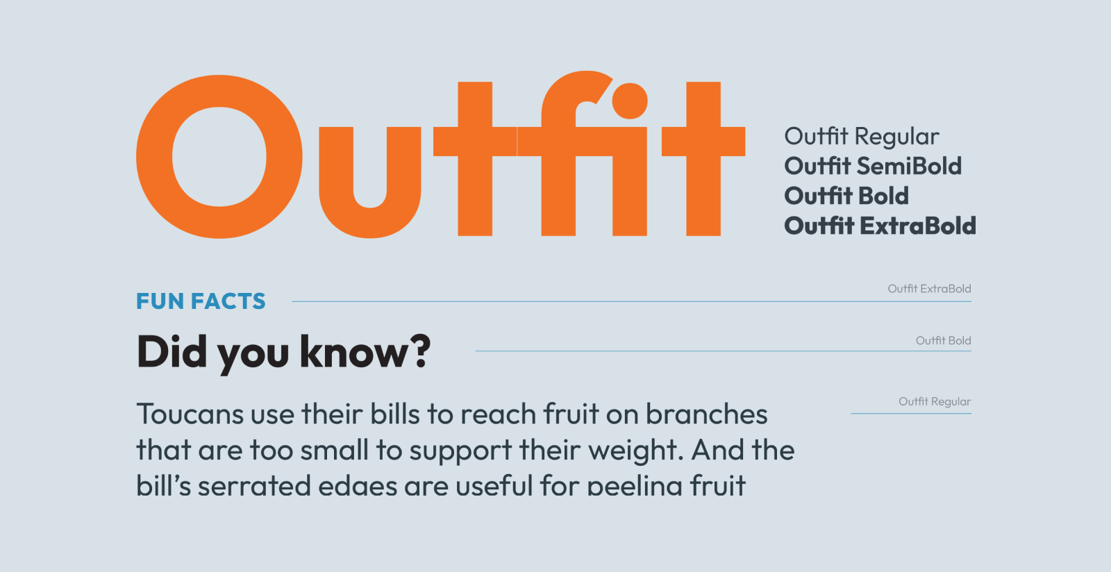

Step 1 was to develop a new identity and design direction that would become instantly recognisable and add personality and shareability for the brand.
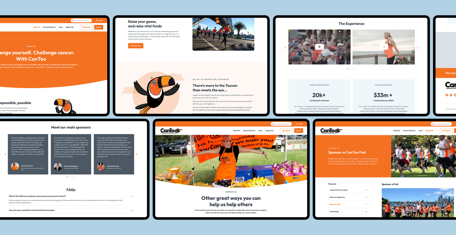
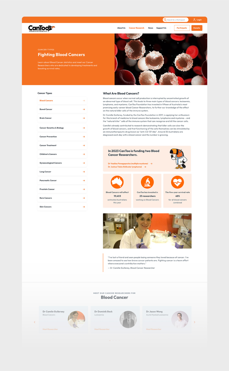
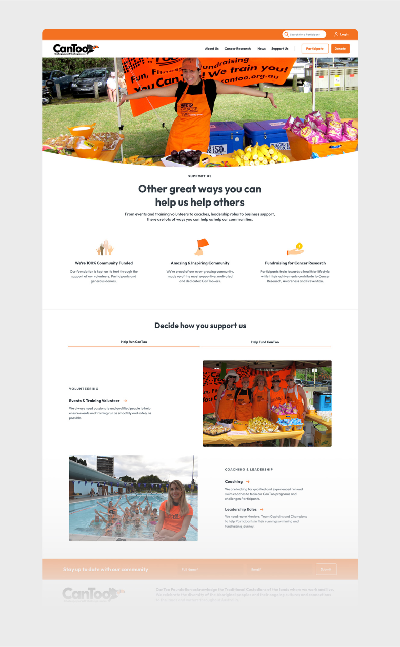
Step 2 was to refresh the website by building out reusable templates and modules to make it easier to find information for programs, donate to the charity, and become a volunteer. This would provide the tools for staff to build out additional content and pages as required.
Step 3 required developing a comprehensive set of guidelines to help volunteers and staff align new content, events and programs to the new brand and visual direction.

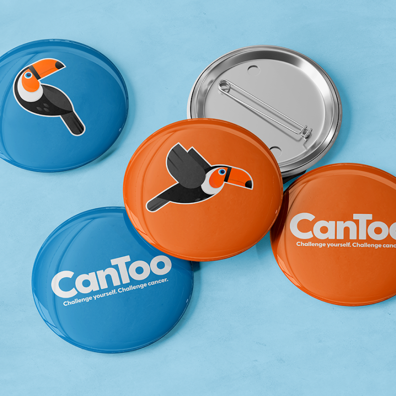
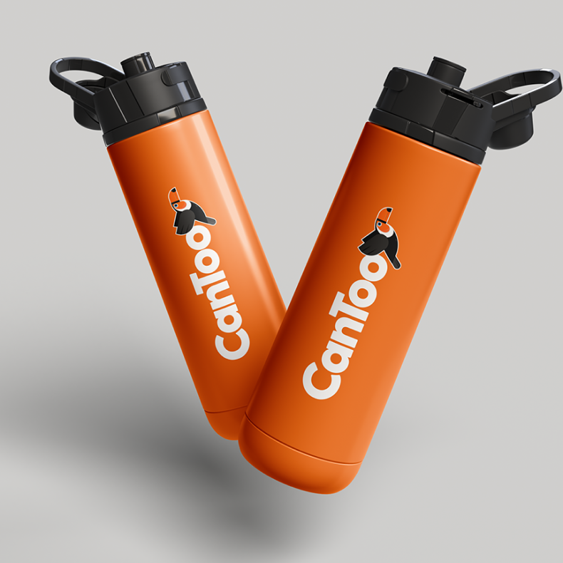
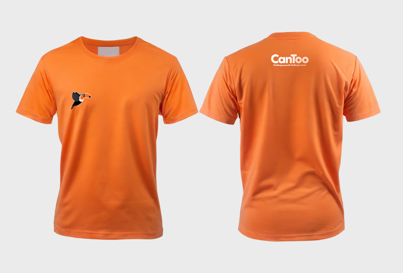
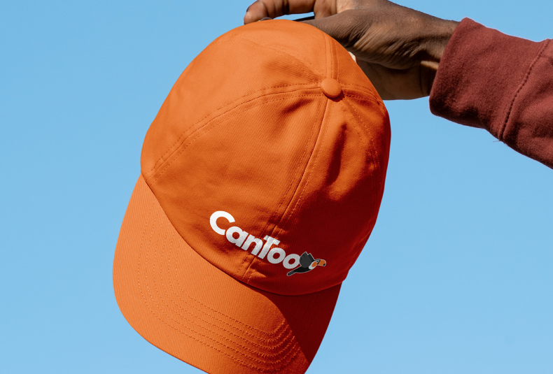
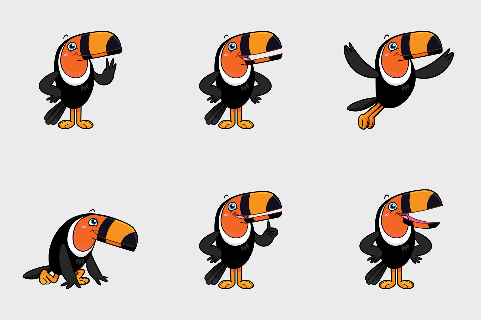
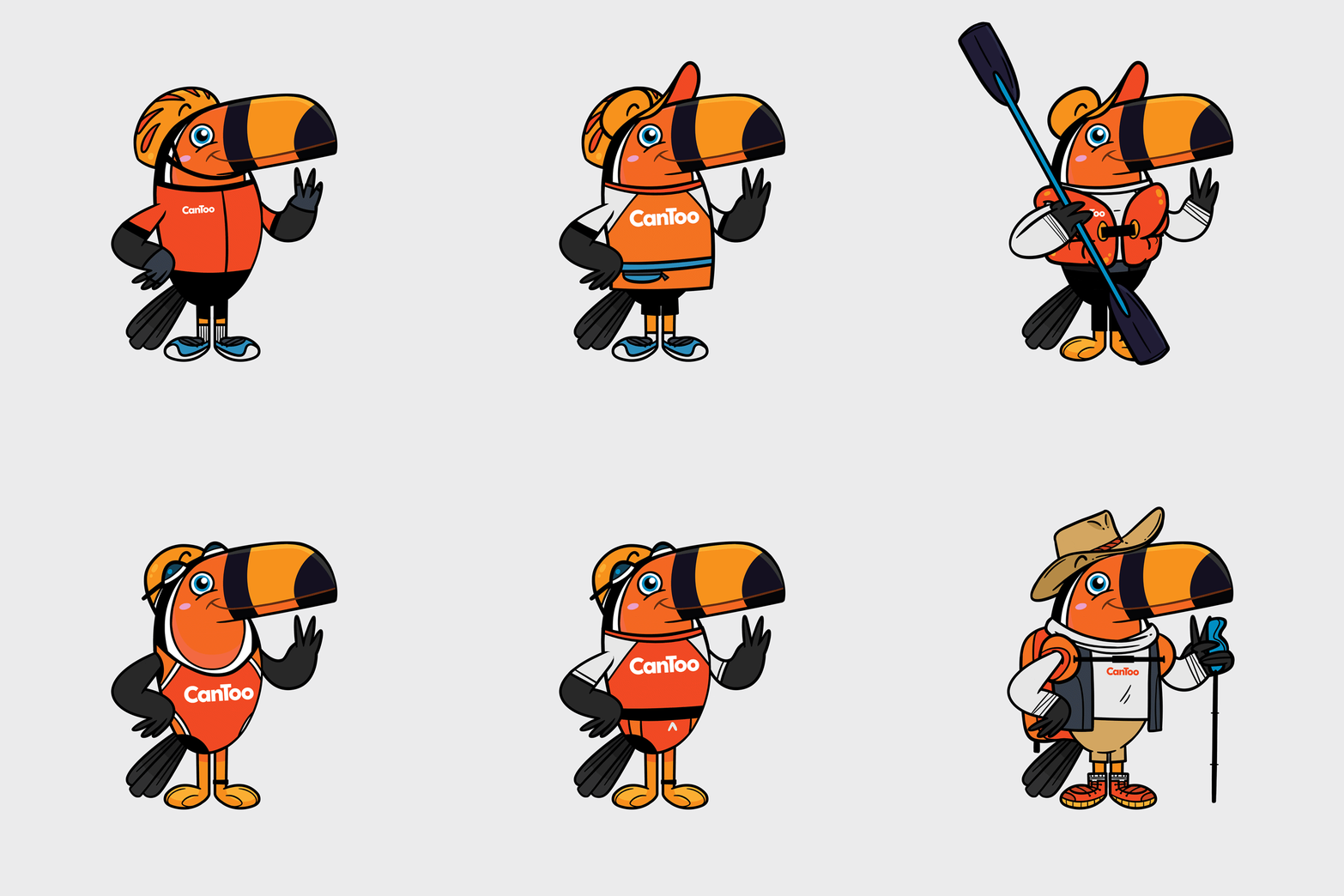
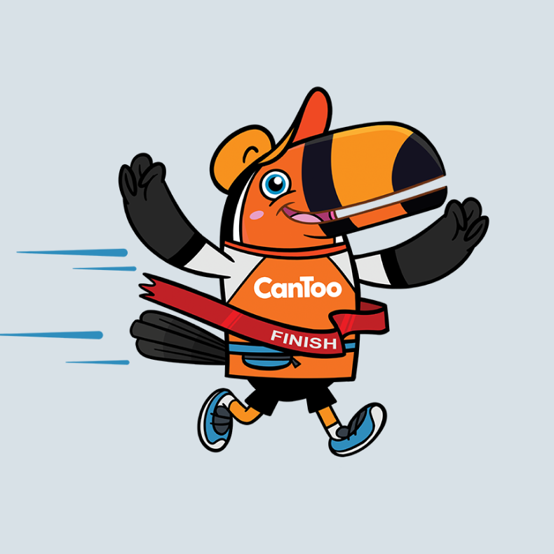
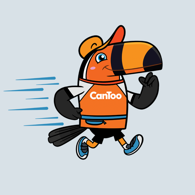





We created the idea of a Toucan character and mascot, based on a simple play on the CanToo name and the distinctive orange of the CanToo brand.
The Toucan is seen as a social creature, often associated with good luck and representing the idea of 'self-confidence', which we felt aligned with what CanToo aims to develop and encourage through their programs. From this, the core logo and character library were developed that could be used across marketing and social content to build the personality and tone of the brand.
From this, a new positioning line and tone of voice were developed to help showcase and define the brand's point of difference and unique offering.
We then created a full design system and online platform that not only improved the customer experience when engaging with CanToo programs and services but also simplified the donation process.
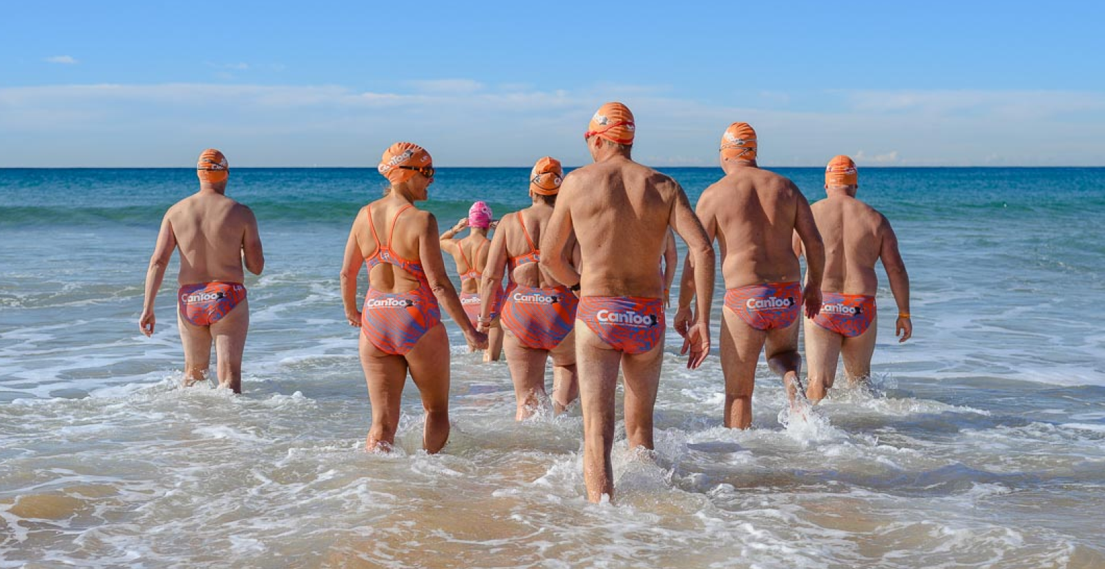
The outcome has been well received, adding a fresh, fun and friendly identity to the brand and providing consistency and direction both online and through external fundraising events and programs.
